


Crypto.com Prepaid Visa · US
The US funding guide describes adding funds to the card from crypto or cash. An optional Auto Top-up also exists: a separate balance does not have to mean manual funding.
A crypto wallet paired with payment cards.
Designed to connect digital assets with everyday purchases.
The Future of
Your Wallet.
I designed 28Pay from June to September 2025, over three months outside my day job. As the sole designer, I owned the brand and logo, UX and UI, marketing materials, App Store screenshots, and the app-download landing page.
The central design challenge was defining the relationship between receiving crypto, getting a card, and making money available to spend. I worked through that question with the stakeholder, then delivered the designs to the client and engineering team. My engagement ended at handoff.
The product brings a crypto wallet and payment cards into one app. The wallet receives and manages crypto assets; the card provides a way to pay for meals, shopping, and online services. The original application designs offer Visa and Mastercard choices.
Choose an asset and network to receive funds into the wallet.
Choose a card and complete the application and identity checks.
Move funds from the wallet to the selected card. Its balance is shown in USD.
Use the card’s available balance for everyday and online purchases.
Getting a card and funding it are separate steps. Money received in the wallet is not automatically available on a card.
The stakeholder wanted people to bring crypto into 28Pay and use a card for everyday purchases. The ambiguity was in the requirements: where should incoming funds sit, what does opening a card actually enable, and which balance does a payment use? We needed to agree on these rules before the screens could give a clear answer.
One wallet receives the crypto.
Each card is funded separately.
External crypto deposits needed to enter through the wallet, not directly into a card. We made the wallet the common place to receive and manage assets, so adding another card would not require a separate deposit destination.
Choosing Visa or Mastercard and completing the application gives the user a card. It does not move money onto it. I separated application completion from funding so “card issued” would not be mistaken for “money ready to spend.”
With several cards, the destination matters as much as the amount. A manual top-up lets the user choose which card receives funds and review the amount before confirming. The return flow lets card funds move back to the shared wallet.
A separate card balance adds a funding step and another balance to understand. My design response was to keep the selected card, source balance, and amount visible together, rather than imply that all wallet funds were ready to spend.
The decision is visible in the delivered screens: asset details within the wallet, a named destination card, and separate funding and return flows.
Official documentation reviewed in October 2026 provides context for this case study. It is a retrospective comparison, not research conducted during the 2025 project.
The US funding guide describes adding funds to the card from crypto or cash. An optional Auto Top-up also exists: a separate balance does not have to mean manual funding.
Its official card guide describes a stablecoin-based card for spending crypto at online and in-store merchants. It is a real-world example of the product category, not evidence that its funding model matches 28Pay’s.
For 28Pay, separate balances and manual funding were the agreed product model. These examples help explain that choice; they do not establish 28Pay’s conversion, custody, or settlement rules.
The wallet contains assets such as BTC, ETH, and USDT. Each payment card has a separate balance shown in USD. Users manually fund a selected card from the wallet and can transfer card funds back. The wallet shows what you hold; the card shows what you have set aside to spend.
Multiple crypto assets
Deposit into walletSeparate balance shown in USD
Available for card spending*Choose a card, complete the application and identity checks.
Then fund the card separately.
Add money to the wallet.
External funds → WalletChoose a card and complete the application.
Card status changesMove money onto a selected card.
Wallet → CardMove card funds back to the wallet.
Card → WalletThe card picker uses names and last four digits. Funding is tied to a specific card, even when several cards share the same wallet as their source.
Funding a card and returning its funds connect the same two balances. The transfer view identifies which account the money leaves and which receives it.
The flows cover receiving crypto in the wallet, funding a selected card, and withdrawing wallet assets to an external address. Each step makes the destination and the next action visible.
I separated asset, method, and network selection before showing the receiving address. The address screen keeps the chosen asset and network visible while the user copies or shares it.
28Pay is the receiving side. The user takes these details to the platform or wallet they are sending from.
Receive crypto into the wallet from an external wallet or platform.
Choose the crypto asset being deposited.
Select the on-chain deposit route for the chosen asset.
Show minimum amounts, confirmation requirements and the network warning before the address.
Pair the QR code and copyable address with the selected asset and network.
An expanded view supports an additional check of the token contract.
Network requirements appear where the network is selected, then remain visible beside the receiving address.
“Select the network, copy it to the sending side; this is the receiver.” This note guided the deposit sequence.
Original designs with sample addresses and network requirements.
Choose the destination card, review the top-up amount in USD, and confirm the funds received.
The card, its balance, and “充值卡片” share one view. This is where the funding journey begins.
Card names and the last four digits identify the destination before the amount is entered.
The selected card stays visible beside the USD amount, source balance, and fields for fees and the amount received.
An arrival confirmation acknowledges that the funds have reached their destination.
Wallet deposit starts with an asset and network. BTC, ETH, and USDT have their own balances; a USD equivalent expresses their value without implying a currency exchange.
The form labels its source “USD 錢包餘額” and shows the top-up amount in USD. This step focuses on the selected card and amount; it does not repeat the asset selector from wallet deposits.
The designs establish the user-facing funding flow and USD display. The timing of crypto conversion and the issuer’s custody and settlement arrangements were not confirmed within my scope. Sample amounts and card details vary across screens.
This reading guide separates having funds, having a card, and being ready to spend.
This scenario starts with wallet funds and no card. Show card application as the next step, without implying that the wallet balance is already available for card spending.
Make the location of the funds and the next action clear.
Clarify whether and how funds can be returned while the card is frozen.
Further design work, subject to product and operational requirements.
Application establishes access to a card. The completion screen then points toward funding it.
Wallet funding, identity verification, and card application are shown as distinct stages.
The original selection sheet shows Visa and Mastercard options before confirmation.
Country, city, address, and postal code form a dedicated step.
The payment sheet brings the amount and selected wallet asset into focus.
A processing state explains that the application is still underway.
The completion screen leads into top-up, continuing the money journey.
Original designs with sample data. Application payment and card top-up are separate steps.
Choose an asset and network, enter or scan the destination, and review the amount and cost. Then verify with Face ID and check the transfer status and result details.
Start with the asset and its available balance.
Keep the network, address, amount, fee and received amount together.
Show the network alongside its fee and estimated arrival.
Keep address entry connected to the withdrawal details.
Scanning offers another way to enter the destination.
An identity confirmation step follows the withdrawal details.
Submission is acknowledged while the transfer awaits review.
Keep the status and transaction details available after submission.
The form keeps the destination, sent amount, fee and received amount in view before verification.
Processing and result views make the status and transaction details available to review.
Original design states with varying assets, networks and amounts; not one completed transaction.
Use one consistent transaction example, clarify the processing-stage labels, and design failure and timeout recovery. The screens show status feedback; they do not establish those recovery rules.
The same relationship carries through balance labels, transfers, and card activity.
Tap USDT to view its details · Swipe to explore
Select USDT
One asset within the wallet
A separate card balance
The wallet overview leads into individual assets: selecting USDT reveals its balance, funding-account distribution, and history. The card has a separate balance shown in USD, with “充值卡片” keeping funding in the card context.
The card screen’s “帳戶餘額” could be more explicit. I would test “Card balance” to check whether people identify the spendable amount.
Fund the selected card for spending.
Return card funds to the wallet.
From the card homepage, open management and choose “劃轉.” The transfer view connects the selected card and wallet in either direction. Below is the card-to-wallet path.
Open its management settings.
Transfer is an action on this card.
The direction control sits between From and To.
Both accounts stay in view.
Review the source and destination.
The success state closes the journey.
Original connected Figma screens; card details, amounts, and exchange terminology are sample design content.
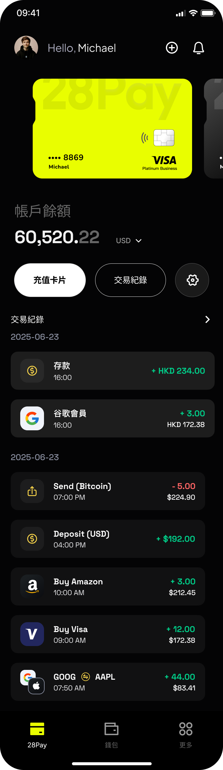
I kept the selected card, its balance, and activity together.
The card above the amount identifies which balance is shown.
“充值卡片” gives the balance a next action.
Dated transactions connect the balance to amounts, currencies, and activity.
Original interface · sample transaction data
Color choices bring the brand into card selection while preserving a consistent layout.
Original card selection screens · tap a screen to explore
I delivered the brand, product designs, and supporting marketing materials to the client and engineering team. Our collaboration ended at handoff, so I cannot confirm the subsequent launch status or business outcomes.
Separate balances made funding a specific card explicit, but added a step. The design work was making that step understandable across deposits, funding, returns, and withdrawals.
Network and address identify a deposit destination. Card identity anchors funding. Progress and transaction details explain what happens after a withdrawal is submitted.
One wallet and multiple identifiable cards could support organizing spending by purpose, such as subscriptions or daily purchases. This remains a future direction, not a delivered feature.
A reference for that future direction: RedotPay describes using card themes to distinguish work and personal cards. Visual organization is different from enforcing spending rules. Reviewed October 2026.
Can someone explain why a funded wallet does not automatically mean a funded card?
Can they select the right card, identify the wallet source, and explain the received amount?
Can someone choose the matching asset and network, then locate the receiving address?
Can they explain the fee and received amount before submitting, then find the status and transaction details afterward?
Can they connect a transaction’s amount and currency to the selected card?
These are proposed checks, not completed research or measured results.